Make Them Reach.
Make Them Remember.
It’s not just a label – it’s a split-second decision in your favor.
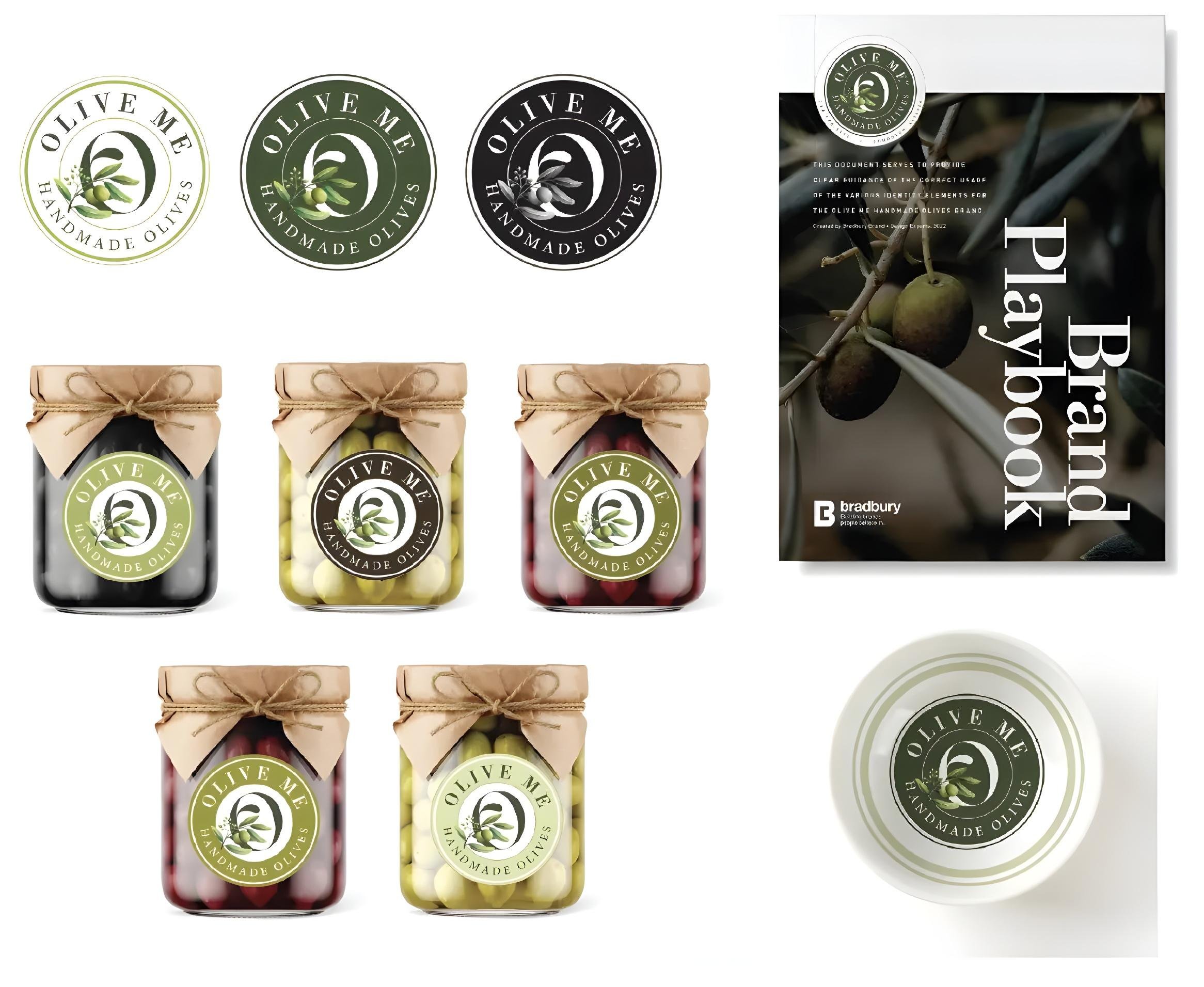
LABEL DESIGN
Most labels merely inform. The great ones transform. We craft labels that turn ordinary containers into objects of desire and browsers into customers. Your label competes with every visual message bombarding consumers daily. We design with this reality in mind, creating labels that stop eyes, engage minds, and open wallets. Our approach balances legal requirements with creative opportunity. We understand the alchemy where typography, color, and material create something greater than their sum. In a marketplace of split-second decisions, your label isn't decoration - it's your hardest-working salesperson.
Services
- Package Design
- Label Design
- Logo Design
- Brand Guidelines
- Romance Copy
- Custom Illustration
- 3D Mockups
- Package Testing
- Sales Materials
- POP Displays
- Trade Show Displays
- Regulatory Compliance
- Packaging Refresh
Frequently Asked Questions
1. What are the essential components of a compliant food & beverage label?
Here’s the truth about food label compliance: it’s not about following rules – it’s about respecting your customers. Creating a compliant food label ensures your customers can make informed choices while protecting your business from costly regulatory issues.
Every food and beverage label in both Canada and the United States must include essential mandatory components, though there are key differences in requirements and formatting between the two countries. Here are the core labeling elements required in each jurisdiction:
Statement of Identity: Product name using common or standardized terms
Net Quantity Declaration
1. Canada: Metric units (mL/L, g/kg) primary; imperial optional
2. United States: Metric or customary units; bottom 30% of front panel
Nutrition Facts Panel
1. Canada: 13 core nutrients in English/French; includes kilojoules
2. United States: FDA format; different terminology (e.g., “Total Fat” vs. “Fat”)
Ingredient List
1. Both: Descending order by weight
2. Canada: Black sans-serif font; sugar ingredients grouped as “Sugars/Sucres”
3. United States: Standard format; no sugar grouping requirement
Allergen Warnings
1. Canada: 11 allergens (includes sesame, sulphites, molluscs)
2. United States: 9 major allergens
Date Marking
1. Canada: “Best before” for foods <90 days shelf life
2. United States: Varies by product type
Manufacturer Information: Company name and address (both countries)
Key Canadian Differences: Bilingual labeling required, metric priority, 11 vs. 9 allergens warnings, and country of origin declaration for certain foods
Following these requirements protects your customers and your business while ensuring regulatory compliance in both markets. Note that creating one label compliant for both countries is generally not possible due to these regulatory differences – separate labels are typically required for each market.
2. How can label design tell my brand's story at a glance?
Your label has one job: make people care. Not just about your product, about what your product stands for. Visual storytelling isn’t about cramming your brand’s life story onto a package. It’s about choosing the right symbols, colors, and words that instantly telegraph your values. Craft beer brands use hand-drawn illustrations to say “artisanal.” Organic brands use earth tones to whisper “natural.” Premium brands use lots of white space to suggest “luxury.” Your brand colors are your emotional vocabulary. Your typography is your personality. Your imagery is your promise. When these elements align, magic happens: instant recognition, emotional connection, purchase decision. Don’t tell your brand story – show it.
3. What fonts and typography guidelines ensure label readability?
Typography isn’t decoration – it’s communication. And communication that can’t be read is just expensive noise. Two simple rules for readable labels: Sans-serif fonts for anything important. Serif fonts for personality only. The FDA requires 6-point minimum for good reason – smaller fonts exclude customers. High contrast isn’t optional—it’s inclusive design. Black on white works every time. Colored text on colored backgrounds? Only if you’ve tested the contrast ratio. Remember: your beautiful script font means nothing if a 65-year-old customer can’t read it in dim grocery store lighting. Accessibility isn’t a constraint, it’s the responsible choice and smart business.
4. How can I make my labels stand out under store lighting?
Store lighting is not your friend. Those harsh fluorescents and relentless LEDs don’t care about your brand, your colors, or the hours you agonized over that flawless label. They’re designed to sell everything – which means they’re optimized to sell nothing. They bleach out the bold, spotlight the wrong details, and leave brilliance flat on the shelf. The smart brands? They don’t curse the lights – they choreograph with them. At Bradbury, we know a matte finish swallows glare and lets your message speak. Metallic foils? A flash of intentional sparkle. Spot-UV? Your chosen detail in the spotlight. We design labels for the shelf, not an art gallery. Your packaging doesn’t have to fight the lights. It just needs to learn how to shine in them.
5. What are common label design mistakes to avoid?
Label design mistakes follow a pattern: they prioritize the designer over the customer. Too many fonts? You’re showing off, not selling. Low-resolution graphics? You’re cutting corners where it matters most. Too small typography? You’re excluding customers who need glasses. Missing required information? You’re inviting regulatory trouble. Here’s the truth: your label isn’t art, it’s a sales tool. Every element should either inform, attract, or convince. If it doesn’t do one of those three things, it’s clutter.
The 5 Most Damaging Label Design Mistakes:
1.Overcrowding your label with too much text or too many design elements
2. Using low-resolution images or graphics making your product look cheap
3. Hard-to-read text affecting customers who may have visual impairments
4. Missing must-have info like nutrition facts, ingredients, or warnings
5.Weak branding – your label doesn’t make it easy to spot your brand at a glance
Great label design fixes all of these by making every detail clear, useful, and easy to spot on the shelf.
Our Reviews
What Our Clients Say
EXCELLENTTrustindex verifies that the original source of the review is Google. It’s fair to say that I approached the Bradbury Brand Imprint process with a certain amount of hesitation. I felt that we had already invested so many resources into analyzing our brand and our messaging both internally and with our stakeholders. I was, therefore, incredibly surprised and excited when the process revealed something entirely new to me about our brand – and that new idea became one of the major principles of developing our new visual identity.Trustindex verifies that the original source of the review is Google. Our Foundation has been working with Bradbury Design since 2015. They are responsible for a brand re-fresh that breathed new life and focus into our public image, and defined our visual personality. Catharine and Bree have become trusted partners and always find a way to deliver on time and on budget. Thanks for making us look so good. Wes Fyck, Director, Marketing and Communications Hospitals of Regina FoundationTrustindex verifies that the original source of the review is Google. Bradbury Brand & Design always delivers high quality beautiful work in a timely and professional manner. Highly recommend!Trustindex verifies that the original source of the review is Google. I wanted Bradbury to create a logo for me for a new venture and a brand is so much more than a logo of course. Bradbury did extensive research of the industry, identified my target market and helped me understand and create my brand story, identity and message. They were incredibly helpful and knowledgeable. They are experts at what they do but are also really lovely to work with in that they are open to a collaborative effort. I can’t recommend Bradbury enough. I trust them with my brand completely and feel confident that I can launch knowing that my brand is rich in substance and represents not only my product well but who I am and what I want to convey.Trustindex verifies that the original source of the review is Google. Great Experience with my website, they really took time to understand what I was looking for. No reservations in recommending Bradbury. Sebastian - W4 Projects ServicesTrustindex verifies that the original source of the review is Google. Working with Bradbury also gets the creative juices flowing. They understand the impact of our work and have the skill and expertise to communicate and brand it.Trustindex verifies that the original source of the review is Google. Bradbury Brand's team of experts provide high quality design work with exceptional service. It's always a pleasure to work with Catharine and her team.Trustindex verifies that the original source of the review is Google. Looking back on almost 30 years of socially engaged arts practice, we wanted something that reflected our innovative and forward thinking approach while respecting the strong roots and history of the organization. The team at Bradbury worked with us to find branding choices that spoke to both priorities, resulting in a new look that we are truly proud of. Catharine's joy and excitement is infectious, and she has the experience to back it up. Anyone who has the chance to work with Bradbury is fortunate indeed.Trustindex verifies that the original source of the review is Google. Working with Catharine and Bree and the team at Bradbury Brand + Design Experts has been an absolute dream! They are professional, down-to-earth, and incredibly gifted at what they do, paying particular attention to the little details that matter. Their expertise will make you look and feel like a million bucks (on a budget!), and their kind hearts will make collaborating a truly wonderful experience.Trustindex verifies that the original source of the review is Google. I've had the pleasure of working with Catharine and her team many times over the years, on everything from simple print ads, to infographics, annual reports, and a major refresh of our visual identity. They always deliver what we as the client asks for. Catharine is open to criticism/feedback; she explains her rationale for design decisions, then listens to and finds ways to incorporate our input. The Bradbury team is clear in their communication with us, and deliver proofs and final products to deadlines set out in the production schedule. She always builds in sufficient time for reviews of, and changes to, proofs. Their final billings are always consistent with estimates. There are never any surprises. Catharine will always flag in cases where costs are going to exceed the original estimate she provided. Catharine does a great job of staying on top of things. The quality of her finished work is always top notch. She personally manages our account, which is big plus of working with a smaller "boutique" agency. Catharine and her team always deliver great creative that comes in on time and on budget.