Pages Worth Pausing For.
Every page designed to make you stay just a little longer.
PUBLICATION DESIGN
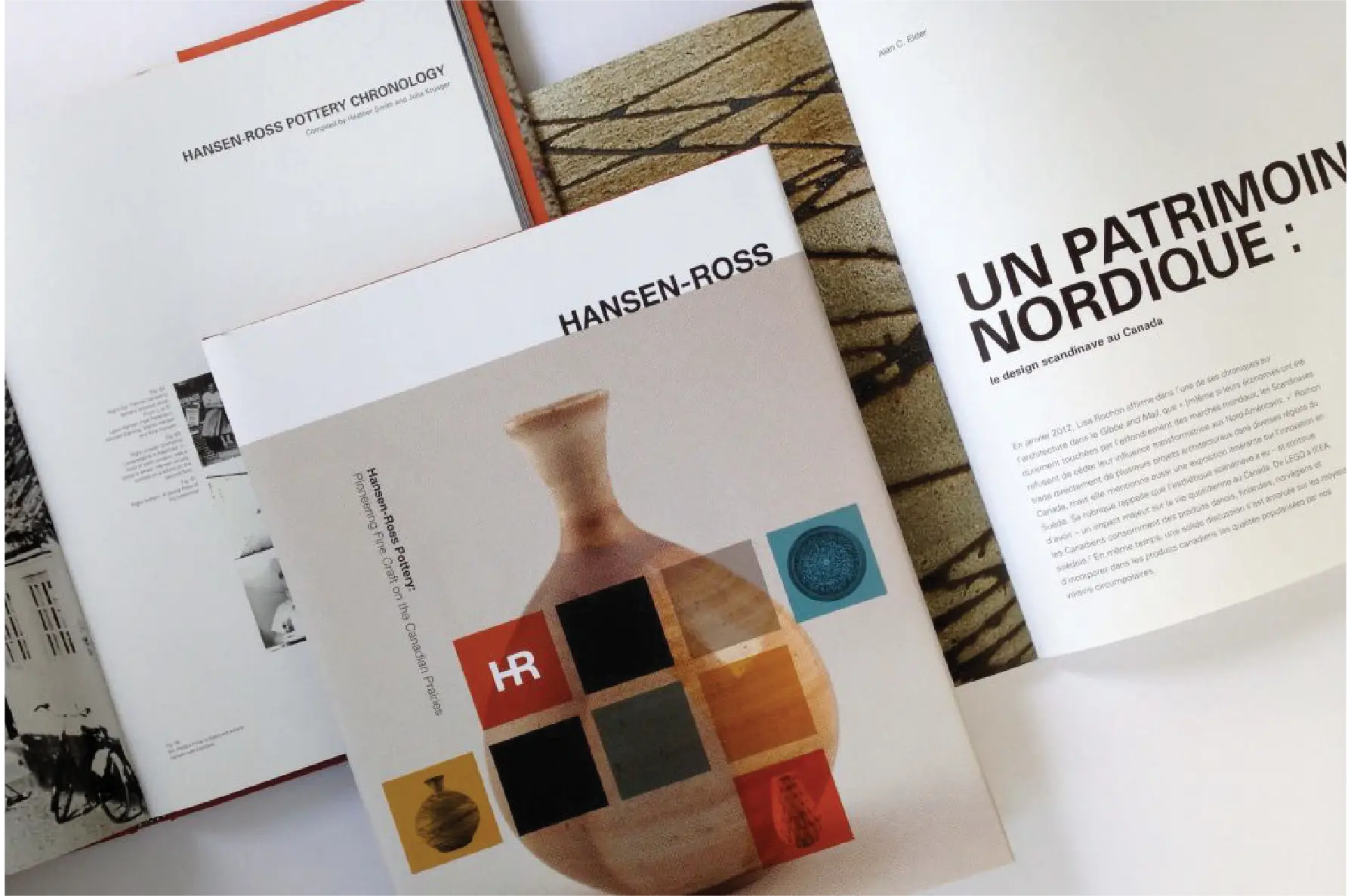
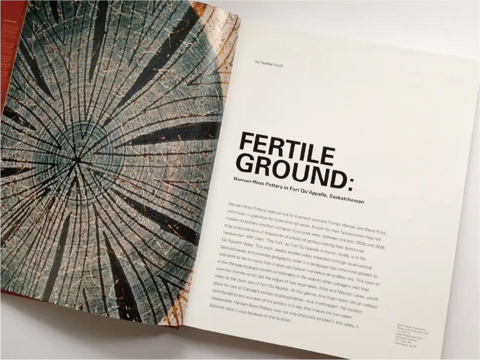
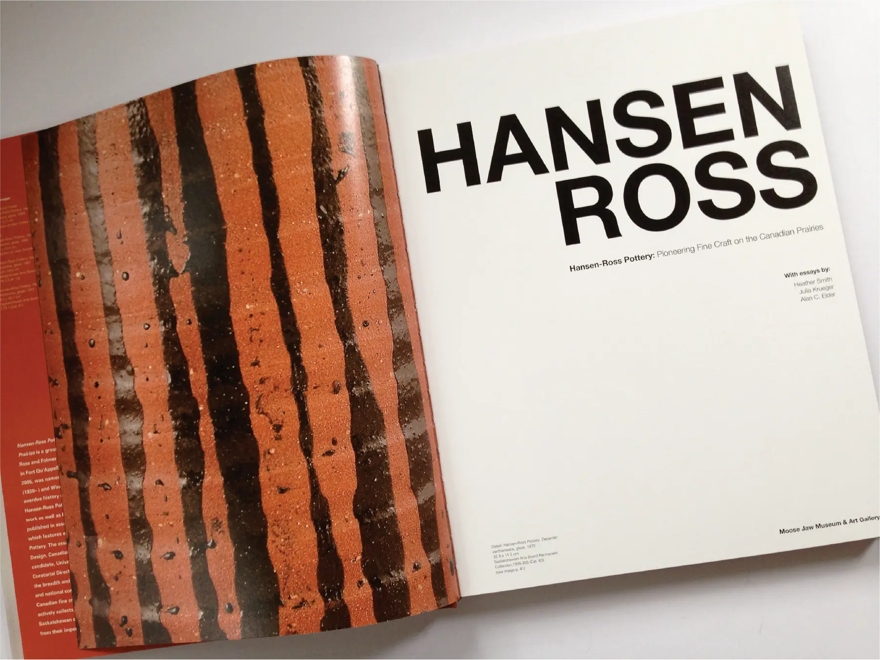
At Bradbury Brand + Design Experts, we craft publications that draw people in and invite them to linger, whether it’s a striking coffee table book, a milestone celebration, or a showcase of the arts. From cover to final page, we orchestrate every element to serve both author and reader, creating visual rhythms that enhance comprehension and emotional resonance. We balance tradition with innovation, respecting the timeless principles of typography while embracing the possibilities of contemporary design. In a world of infinite content, publications that are not just read but cherished, shared, and remembered for years to come.


Services
- Logo Design
- Brand Identity
- Digital Design
- Packaging
- Social Media Design
- Print Design
- Marketing
- Collateral
- Motion Graphics
- Brand Guidelines
- Custom Illustration
- Presentation Design
- Infographic Design
- Corporate Stationery
- Signage Design
- Annual Reports
- Investor Relations Materials
- Publication Design
- Exhibition Catalogues
- Postage Stamps
- Vehicle Graphics
Frequently Asked Questions
1. What is publication design?
Publication design is the step-by-step process of turning your text and images into a polished book or magazine. Think of it as curating an art gallery for your words. We choose easy-to-read fonts so clear you could proofread blindfolded, arrange photos and text in balanced layouts that flow like well-lit exhibit halls, and add plenty of white space so pages never feel crowded. We choose the right paper and recommend bindings – paperback, saddle-stitch, or hardcover – so every spread feels like a masterpiece that readers can’t put down.
2. How long does a book layout project take?
Book design follows a journey from concept to finished pages. Most book layouts take 8 – 16 weeks. That includes setting your text, arranging images, making edits, and testing print proofs. We’ll give you a clear schedule up front so you know exactly when your files will be ready. By pacing each stage carefully, we ensure your final product resonates with even the most discriminating readers.
3. Can Bradbury design both print and digital publications?
Imagine your book available both on the coffee table and on your reader’s tablet. Bradbury seamlessly translates your print layouts into interactive digital experiences, preserving typographic finesse and color accuracy while layering in dynamic elements that invite exploration.
Whether you’re creating art exhibition catalogues with zoomable high-resolution images, annual reports with interactive financial charts, or magazines with embedded video interviews, we ensure brand consistency and visual excellence across both formats. Your print edition maintains its sophisticated typography and premium paper feel, while your digital counterpart offers modern conveniences like searchable text, bookmarking capabilities, and instant social sharing.
4. What goes into designing art exhibit catalogues?
Designing an exhibit catalogue is like composing a symphony. Each page is a movement, sequenced to build emotional peaks and quiet interludes that guide visitors through your creative narrative. We pair museum-grade image reproduction with elegant typography, interweave curator commentary, and use whitespace as rests between visual moments.
The technical precision behind this artistry involves capturing every brushstroke, texture, and color nuance through high-resolution photography and calibrated color matching.
Each catalogue receives custom typographic treatment, selecting fonts that complement rather than overshadow the artwork, while paper selection considers both aesthetic and archival qualities. From heavyweight uncoated stocks that provide museum-quality color reproduction to specialty papers with subtle textures, every material choice reinforces your exhibition’s curatorial vision and creates a keepsake worthy of coffee tables and institutional libraries alike.
5. What print materials and finishing techniques should I choose?
Here’s the thing about print materials: they’re not just a vessel for your content – they’re part of the message itself. Most publications play it safe. Ordinary paper. Standard binding. Predictable finishes. They blend in because they’re afraid to stand out.
Instead of following the crowd, imagine what your ideal reader will feel when they hold your publication. Because every choice, from paper to finish, is an opportunity to shape their experience.
Choose paper based on content:
1. Text-heavy: Uncoated paper (70-80 lb.) reduces eye strain
2. Visual content: Coated stock (80-100 lb. gloss/silk) enhances images
3. Balanced: Premium cover (100 lb.) with quality interior pages
Select binding for function:
1. Perfect binding: Professional look for 64+ pages
2. Saddle-stitching: Economical, lays flat for workbooks
3. Wire-o/spiral: Keeps manuals open during use
High-impact finishing techniques:
1. Soft-touch lamination: Creates tactile appeal
2. Spot UV: Highlights key elements with glossy effects
3. Foil stamping: Adds metallic accents that catch attention
4. Embossing: Creates dimension without color
We’ll guide you through every option, helping you align your materials and finishes with your creative goals and budget, so your publication stands out and gets remembered.
6. Why choose Catharine Bradbury for your publication design?
For over 30 years, Catharine Bradbury has transformed publication design into a precision art grounded in both evidence and empathy. Her approach combines rigorous reader behavior analysis with storytelling sensibility – studying how eyes move across pages, applying color science to evoke specific emotions, and testing prototypes to optimize engagement. This methodology has earned her recognition through hundreds of national and international awards, though she measures success not by accolades but by reader connection.
Catharine’s portfolio spans sophisticated art exhibit catalogues, corporate history books, annual reports, and magazines. What distinguishes her work isn’t just visual appeal, but the strategic fusion of typographic mastery and narrative insight. Each publication she designs creates a journey that guides readers through content with purpose and elegance.
When you work with Catharine, you’re not just hiring a designer; you’re partnering with a visual storyteller who turns information into experience and pages into lasting impressions.
Our Reviews
What Our Clients Say
EXCELLENTTrustindex verifies that the original source of the review is Google. It’s fair to say that I approached the Bradbury Brand Imprint process with a certain amount of hesitation. I felt that we had already invested so many resources into analyzing our brand and our messaging both internally and with our stakeholders. I was, therefore, incredibly surprised and excited when the process revealed something entirely new to me about our brand – and that new idea became one of the major principles of developing our new visual identity.Trustindex verifies that the original source of the review is Google. Our Foundation has been working with Bradbury Design since 2015. They are responsible for a brand re-fresh that breathed new life and focus into our public image, and defined our visual personality. Catharine and Bree have become trusted partners and always find a way to deliver on time and on budget. Thanks for making us look so good. Wes Fyck, Director, Marketing and Communications Hospitals of Regina FoundationTrustindex verifies that the original source of the review is Google. Bradbury Brand & Design always delivers high quality beautiful work in a timely and professional manner. Highly recommend!Trustindex verifies that the original source of the review is Google. I wanted Bradbury to create a logo for me for a new venture and a brand is so much more than a logo of course. Bradbury did extensive research of the industry, identified my target market and helped me understand and create my brand story, identity and message. They were incredibly helpful and knowledgeable. They are experts at what they do but are also really lovely to work with in that they are open to a collaborative effort. I can’t recommend Bradbury enough. I trust them with my brand completely and feel confident that I can launch knowing that my brand is rich in substance and represents not only my product well but who I am and what I want to convey.Trustindex verifies that the original source of the review is Google. Great Experience with my website, they really took time to understand what I was looking for. No reservations in recommending Bradbury. Sebastian - W4 Projects ServicesTrustindex verifies that the original source of the review is Google. Working with Bradbury also gets the creative juices flowing. They understand the impact of our work and have the skill and expertise to communicate and brand it.Trustindex verifies that the original source of the review is Google. Bradbury Brand's team of experts provide high quality design work with exceptional service. It's always a pleasure to work with Catharine and her team.Trustindex verifies that the original source of the review is Google. Looking back on almost 30 years of socially engaged arts practice, we wanted something that reflected our innovative and forward thinking approach while respecting the strong roots and history of the organization. The team at Bradbury worked with us to find branding choices that spoke to both priorities, resulting in a new look that we are truly proud of. Catharine's joy and excitement is infectious, and she has the experience to back it up. Anyone who has the chance to work with Bradbury is fortunate indeed.Trustindex verifies that the original source of the review is Google. Working with Catharine and Bree and the team at Bradbury Brand + Design Experts has been an absolute dream! They are professional, down-to-earth, and incredibly gifted at what they do, paying particular attention to the little details that matter. Their expertise will make you look and feel like a million bucks (on a budget!), and their kind hearts will make collaborating a truly wonderful experience.Trustindex verifies that the original source of the review is Google. I've had the pleasure of working with Catharine and her team many times over the years, on everything from simple print ads, to infographics, annual reports, and a major refresh of our visual identity. They always deliver what we as the client asks for. Catharine is open to criticism/feedback; she explains her rationale for design decisions, then listens to and finds ways to incorporate our input. The Bradbury team is clear in their communication with us, and deliver proofs and final products to deadlines set out in the production schedule. She always builds in sufficient time for reviews of, and changes to, proofs. Their final billings are always consistent with estimates. There are never any surprises. Catharine will always flag in cases where costs are going to exceed the original estimate she provided. Catharine does a great job of staying on top of things. The quality of her finished work is always top notch. She personally manages our account, which is big plus of working with a smaller "boutique" agency. Catharine and her team always deliver great creative that comes in on time and on budget.
