

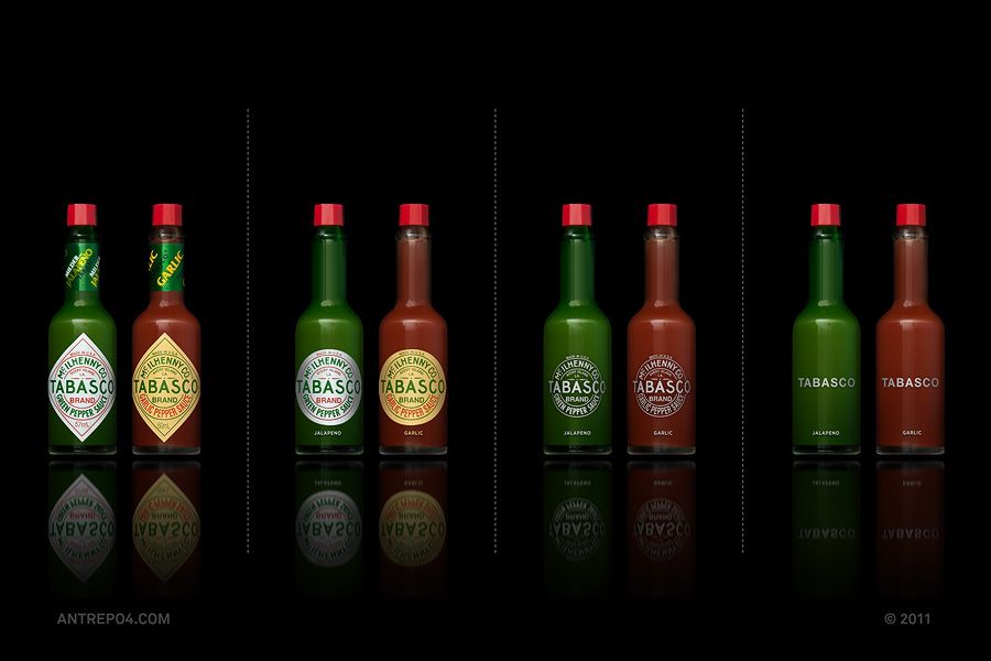


The Logo Trap
“I just need a logo.” If I had a nickel for every time I heard a business owner tell me this, I could retire and open a museum of failed businesses that thought graphics was strategy. This phrase reveals one of the most common misconceptions in business development – conflating brand identity with brand strategy.
Understanding the difference isn’t just semantic; it’s the key to building a business that resonates deeply with customers. Jumping straight to designing a logo before establishing what your brand truly stands for is like putting racing stripes on a car that doesn’t have an engine. It’ll look great sitting in your driveway, but good luck getting to the grocery store.

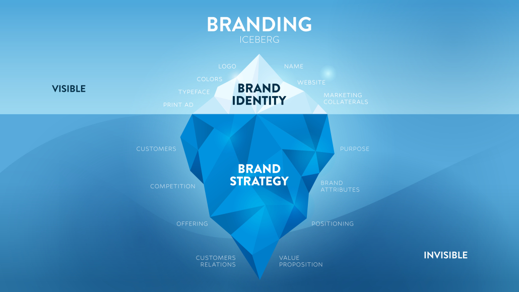
Strategy: The Invisible Foundation
Brand strategy is your north star, guiding every deliberate choice to ensure your business remains authentic and true to its core. It encompasses your purpose (why you exist), your values (what you believe), your positioning (how you’re different), and your target audience (who you serve). This strategic foundation answers the crucial “why” behind everything you do.
Brand identity translates this strategic direction into visual language. These are the tangible elements customers can see, hear, and experience. Your logo, color palette, typography, imagery style, and even your tone of voice collectively form the shorthand that communicates your strategy to the world.

“Branding is the process of connecting good strategy with good creativity.”
– Marty Neumeier, “The Brand Gap”
Building Before Designing
The demand for shortcuts in branding has never been more tempting – or more dangerous. In today’s visually saturated world, businesses often rush to create something that looks good without first establishing what it should mean.
As Debbie Millman wisely observes, “A logo is not a brand; it’s the visible tip of a much larger strategic iceberg.”¹ Embracing a “strategy first” mindset means uncovering your brand’s essence before you ever choose colors or typefaces.
Neglect that step, and you’ll pay the price. Companies that lead with visuals often end up in expensive cycles of rebranding when their logos, color palettes, and typography fail to reflect their true purpose or resonate with customers.
After all, “Great brands are like friends—you encounter a huge number of them every day, but you only remember the ones you love.” That kind of emotional bond isn’t forged by aesthetics alone; it’s built on the solid strategic foundation that gives your visuals genuine meaning.
The Patagonia Example
Consider Patagonia’s journey. Their brand strategy centers on environmental activism, quality outdoor gear, and responsible business practices—values that have remained consistent for decades. Their brand identity (the mountain silhouette logo, earthy color palette, and documentary-style photography) simply translates those strategic values into visual form. Without the underlying strategy, their logo would be just another mountain outline.
The Right Sequence for Success
So which comes first? Always start with strategy. Define your purpose, position, promise, and personality before designing a single visual element. Your strategy should inform every aspect of your identity, ensuring that your visual choices communicate your core values rather than just looking attractive.
Remember: brand strategy is what makes you meaningful; brand identity is what makes you recognizable. When they work in harmony, you create a business that not only looks good but stands for something customers can believe in.